02 — Logo & Concept
The mark.
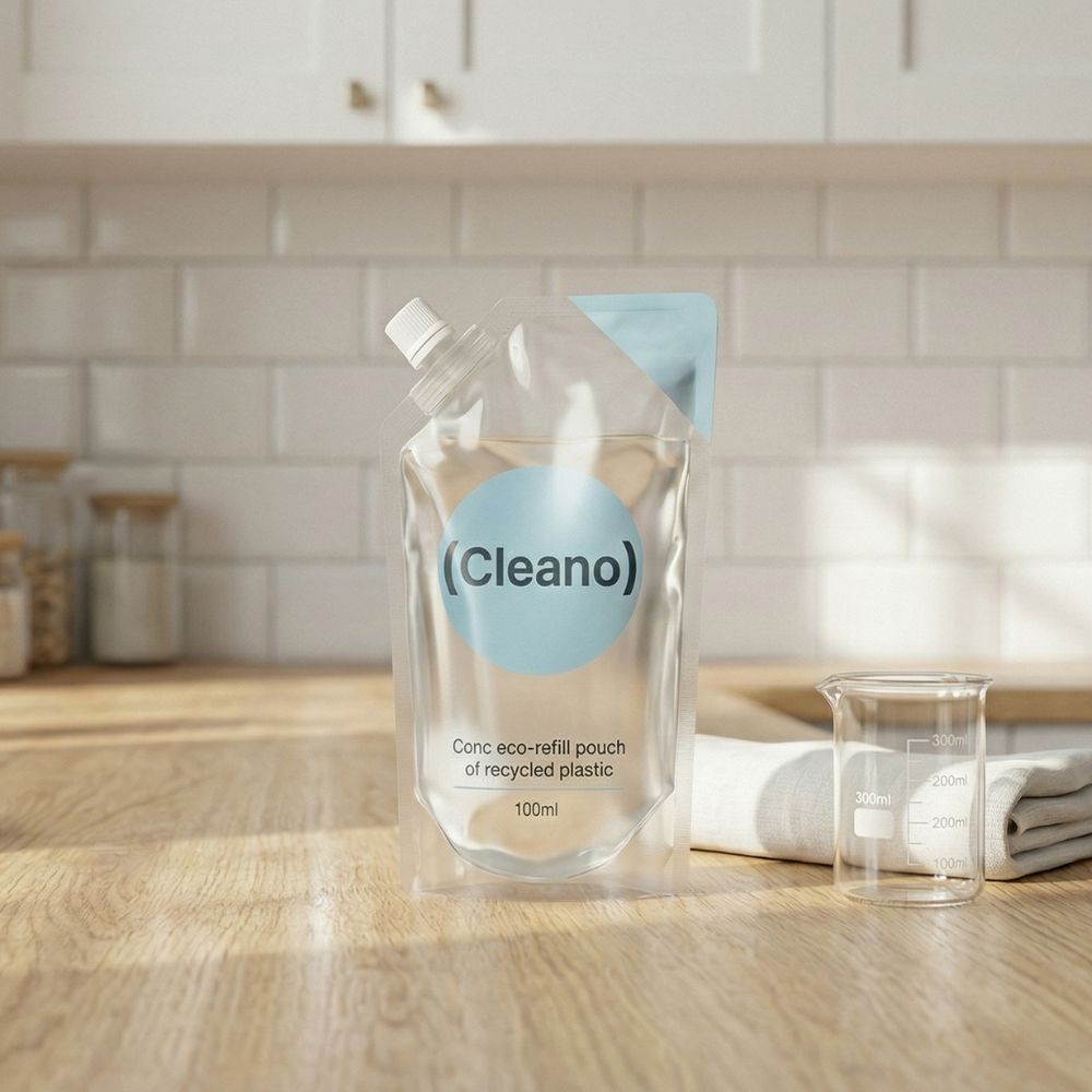
Logo Rationale
The (Cleano) logotype uses parentheses as a distinctive brand device — wrapping the name in a clean, structural embrace that communicates containment, precision, and order.
The circular bracket form echoes the brand's core values: completeness, protection, and cycle-driven sustainability.
Brand Values
Cleanliness
Sustainability
Reliability
Simplicity